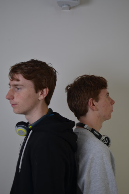
this one is a good photo and could easily be used however the biggest problem is the person (left) who is pulling quite a unique and weird face. This also does not fit in with my research. There is also a problem where at the top of the picture you can see a speaker. This does not look professional.

Now this picture could have been very good as i was going to try and edit this picture in a similar style to that of the contents page. Which was at a similar stage to start with. Both models are in the dark and i would use the dodge tool to fix this and put a slight yellow tint on the medium to light areas.
This photo was the replacement to the top photo as it is a very similar image to the previous one. There is one problem with the fact that you can still see the speaker in the mid - top part but i figured out a way to edit this out........ I think


No comments:
Post a Comment