Sunday 8 May 2016

contents page

Here we Have my chord magazine contents page.
As you can see I've done a lot of photoshop work on the model and the background around him. I used the burn tool over most of the image This created the dark edges you can see. I then expanded the brush used the dodge tool over his face continuously highlighting his face. I did not move the mouse hence why you can see a perfect circle round his face. I then did the same for the vinyl. i then used a small smear of the dodge tool up at the top of the page to create a light smoke-like affect. The font of the stories at the side and the issue number is Dolce Vita this is also the font used in the front page. The title Chord Contents is in a coalition font. We've also put a hashtag at the bottom right hand corner meaning people of our target audience can share their experience.

Front page analysis

So here is my front page.
as you can see the model has been captured with a high contrast on his face. This was captured by shining large lights on one side of his face. We did this so that i could turn the saturation down o 0 where everything was black or white. Then i continued to put a tint on his face that i knew whould mach with the background.
The font used is mostly Dolce Vita however i did use nova for the titles. The side stories are very neat and inline with each other giving it that professional look. There is also a double white line under Bill Myers to section his name off with other stories. White lines are common in magazines but i have done it here to show that Bill Myers is the main attraction here.  I have used a website name and a price at the bottom of the page going upward. A feature of most magazines and a proffesional look.

editor script

Editor Script
How does the magazine represent certain social groups

teens
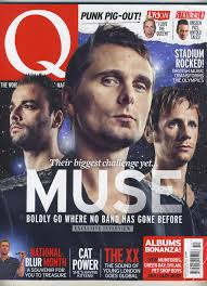
 The front page is a teen DJ showing a stern face. This shows despite the stereotype of teens being “fun-loving”, they can be serious threats in certain industry. 
 The contents page shows some album art from an album featuring elsewhere in the magazine, it shows the model in the spotlight and the vinyl also in the spotlight. Despite this it shows him quite relaxed. This shows that despite the pressure of a spotlight he is cool calm and relaxed.
This is also the same with bill myers on the cover page.
Mise’en’scene, The model on the front cover is wearing headphones. We did this to show that they are constantly into music. This solidifies the serious role they have in the music industry.

Males
Our magazine represents male’s as quite reflective as seen on the front cover unlike the stereotypes of males as reckless and risk taking.
Our contents page shows that males are capable of great success and can rise highs that they didn't expect. 
our main story on the double page spread shows that males can still quarrel despite rising to these highs and greatness of success. 

Why did we use these models.
These models are young meaning they are in their prime and are the future and eventually legacy of dance/ electro music. This is why we feature them on the magazine, more publicity, more fame, more money, people realise that we here at chord mag were the ones who first publicised this sort of talent.
These people are also very reputable in the music industry and are well viewed throughout the world of dance music. So we use them as they are popular this builds on our views.
We also used these models as they fit with our target audience

who would be the audience:

We chose our target audience as teens 20’s and possibly 30’s. We chose this audience as these are the age groups whom are most interested in dance music, these people also love to go to festivals. We are advertising and updating information on euro-  fest. We also asked members of our target audience, they said the font was simple but stylish. They also said that it looks professional. Examples include things like the website and the layout. My target audience have also picked up on the photoshop usage and how professional that looks especially on the contents page. We used hashtags to appeal to our audience, people of that age often use hashtags to share things and involve other people into a certain trend by using a hashtag i am immediately involving an audience who can share what we at chord have told.

Friday 29 April 2016

eval rough plan

Media film is going to be a film of a fake live radio show
We will need:
1.       A small intro
2.       Adverts made
3.       sponsor
Mention travel and weather cut them out.
People asking in
Possible names include:
·         Julius Merlin
·         Brad walker
·         Estelle Lorne
·         Sarah Winslow
·         Connor Lester
·         Jamie Randolph
·         Tilly gale

Distribution companies 3
1.       Frontline
2.       Marketforce
3.       Bauer
4.       Development hell


Q1. Us discussing how different and yet similar it is from other magazines of similar types
Part A - used
1.       Stories on the right.
2.       Uses a website
3.       Stories on a dps
4.       Font similar to dance magazine
Part B – develop
1.       Double lines to underline and split stories instead of single lines.
2.       Uses a hashtag

Part C- challenge
1.       Uses 1 main image for contents page unlike Dj mag Mixmag and Q
2.       That sort of effect on front cover is not used often/ at all
3.       Lines going across whole page. DPS

Q2. Someone tweets in how it represents djs, and youths. We bring Bill myers on and answer it with him.

Q3. An advert from each media product 3 adverts.
Q4. Who is the audience? We chat to the editor on the phone. We ask how did you target a certain audience and who were they.
Q5. How did we attract or address audience on the phone to someone else. 


Monday 25 April 2016

the début....... welcome to Chord Magazine

Ladies and gents the moment that everyone has been waiting for. The suspense has killed many strange beings but we are here....

Chord Mag is here,

for now I will just show you the magazine analysis will come at a later date.


Mojo's turn

Here is a front cover from MOJO. As you can see the model is central, with the title behind his head ( this is a common feature in most magazines). The other stories are on the right hand side. The artists name is on the left hand side. This means that the artist is completely surrounded by text. The magazine is advertising a free CD, this is a professional and efficient way to boost profits. It also looks quite professional.

Sunday 24 April 2016

photos


These are some of the photos from the photoshoot. Most of these have a lot of high contrast with all the light shining on the right hand side of the face. I took the photos from different angles and distances. I got the model in the pose i wanted by telling him to look at certain things sometimes it was the camera other times it was my knee or a certain place in the studio. This helped me get the perfect pose and in turn allowed me to get a great picture. The photos were taken in a studio so we had proper lighting unlike my rough cut. This really helped get the picture i was looking for.


And the winner

Welcome everyone to the awards for the best front cover/page. All 4 of our contestants are credited and recognisable magazine names
and on with the awards in 4th place

and in 3rd place is 

and in 2nd place in a very tight race.

and that means that in 1st place it is indeed DJmag, a well deserved victory.


and the award goes to......................

Welcome ladies and gentlemen to the contents page awards ceremony

in 4th place
.
.


and 3rd place goes to


and 2nd place and only by just goes to
.
.


Which means ladies and gentlemen that 1st place by just a fraction goes to.


MOJO DPS

So here we have the inner alternativeness of MOJO releasing itself here. This DPS has a clear Black white colour scheme with important bits in this goldy brown colour. The font and the sizes are a bit all over the place, in a dance magazine this would never work, however in the title this affect really works. The fact that the image is claimed to be a portrait shows the alternative nature displayed.The picture has a high contrast and everything is either black or white. The model is displayed outside a church this could resemble his importance or his spirituality.

Q DPS

Okay once again here with a Double Page Spread or DPS. (because i couldn't be bothered to write double page spread every time) This looks really good so good job Q. Clear2 stroke colour scheme (red and black) this is reflected in the image as well. The picture has had a red light shot form 1 side of the model. Im a big fan of the lines leading either side of the title, just adds a little bit more style. The big letter in the middle is a classic addition from Q. The drop down capitals are also good despite the fact the font is a default.

honorable mentions

this font is really cool although i wouldn't use it for the magazine. It looks like there is a city behind the font and the letters are a window to the city. It was pointed out to me by a classmate. Good job KC fonts.

Font e

From something similar to the others to something completely different. Aquawax has a few funky features like the gap in the Q. The only font it resembles slightly is the Neon 80s. I think it could also play a similar role in my magazine as for main bulks of text. It could also be used for subheadings but I'm not so sure.

font D

now Nova is very similar to the past few, it is pointy like Neou and yet has the same parallel affect as Dolce Vita. This would be good as a title.

Font C

This font is very straight and point which is what i like, sans serif as with all the rest. I think this would be good for titles.

font b

this is font 2. It looks great although a little thin i like how the A and V are parallel. I think it would look good for small headings and news updates.

Font A

so as some of you are aware I've been reviewing magazines and it struck me that most magazines use other fonts not ones that are just the "defaults" in word. So here is a possible font i could use for my magazine.


the font has got a sans-serif style. I like the curly sort of affect and i think it would look good for large bulks of text.

the scare

So recently i had my work checked by one of the media department heroes at the school and they saw that my magazine bared a striking resemblance to this bit of research.
when they looked at it a bit closer they said to me
"Im sorry to break this to you but i don't think thats a front cover", he then went on to say "i think its a festival poster which DJ have sponsored". This was not good news so the hero took the research to show the media board whom had a hard time working it out but eventually came back to me saying, "it is a front cover and heres why:


  • issues number on the top right hand corner
  • website details printed.

I was in luck however the board did say that this was one of the most unusual magazine covers that they had ever seen. 

awards

Hello just a quick update
Ive reviewed 3 things over and over again in this blog

  1. Front covers
  2. contents pages
  3. double page spreads
I  have also reviewed 4 companies which make these pages in magazines.

  1. Mixmag
  2. DJ
  3. Q
  4. Mojo

So soon i will be doing an award ceremony that will prove that 1 company makes the best contents page, front cover or Double page spread


The awards coming soon

DJ Mag Contents

Hello All
as you can see here we have a contents page from DJ mag. There are some definite positives of the page however Im also not so sure on the designs and colour choices but ill get to those in a sec.

The positives
ok for starters i love how all the models are dispersed round the page. The ones on the left fit neatly into each other like the brickwork of a house. The pictures are well taken and the shadow of the person bottom left works well. The pictures also show a range of artists and equipment.  I would also say that the Contents (top right) works well with the dark grey line running through it.

So what wrong?
I don't like this magazine much for the same reasons i didn't like the first Q magazine i reviewed. The main culprit being the coloured text boxes with text in them. This magazine isn't too bad as the coloured text boxes alternate between non colour and colour. However we look at the colour scheme and we see someone has gone a bit mad. Theres black grey blue pale yellow and dark golden yellow all of these colours make it look like someone really has just discovered that digital colour is a thing. It makes the magazine look childish as well and spoils its look.

Overall average marks for Dj mag

Saturday 23 April 2016

Chord Mag Debut

So deadline day is coming up but i will not release what i currently have of the magazine untill the day before.
The tension builds
The crowd hush's
The Debut

Sunday 24th April 2016

mixmag

So this is the logo for Mixmag and as you can see it has a striking resemblance to the DJ mag title/logo. The circles making up the dot above the i are there to once again supposed to look like a vinyl or a microphone. Resembling DJs and dance music in general.

Clever

This is a cut from a magazine that shows the logo and Title to Dj mag. The font is a sans serif and the colour does vary. There is one bit of really good artwork. The small oval over the J is designed to look like a vinyl. Vinyl being a tool used a lot by DJs.

Improvements


This is a Q contents page and thank the lord its improved from the last. Q has finally done something with the two stroke colour scheme. There are little to no highlighted boxes and the writing works well. The font is still lame and boring. The border round the Q looks good and fits with the black and red colour scheme. We cant really talk about the models because there isn't just one of them taking centre stage like mojo. However they are well dispersed around the left and side of the page.

big shout out

So before i start i have a digital space at school with all my work for this project on. It consist of over 800 photos and roughly 100 other necessities to the project. So big shout out to the media department and the techies for there work please note through this that your support and time has not gone unnoticed.

Photos... If there is one thing i can definitely say I've improved on it is my photography skills. Ive gone from taking photos that consisted of just a black screen or massively unfocused image. To taking pictures fir for an actuall music magazine. I will do some analysis of these at later dates but for now enjoy the improvements.